This oil painting class has been really helpful to me. Even though I have already taken the class before, I found that being more on my own, and it not being a regular class challenge me in different ways than when I took the class fall of my junior year. My first glass panting ended up only being experimental and the work was never completed. However, I learned a few things about glass through the experience, like looking for the highlights, shadows, and color tints to help form the object. By the end of the term, I had finished my own White Objects painting, which helped me with mixing more neutral colors. I had also started a self portrait, and although I did not finish it this term, I started learning the planes of the face, and how shadows and highlights are important in defining the figure. I plan to finish it at home, to work more on the hair as well as the correct proportions. Another painting that I have not totally finished is my architectural space painting. I started this painting because I felt like I had to many still lifes. I also wanted to see how I would approach an architectural drawing, because those style paintings are very different than the figure or the still life. The last piece I finished I am calling Blue Bottle Still Life. I was finally able to accomplish painting glass, and I am really proud of how far I have come and improved over the course of the term. I also felt like I did a good job with painting the fabric; it was one of the first times I feel like I have come close to it looking like actual fabric, with popping out folds.
Overall, I am happy with how this class went. I was able to spend a lot more time painting then normal, because not only did I take Portfolio Development, but I also had a rotating free block, so I spent as much time possible in the studio working on my pieces. I was able to concentrate and feel more comfortable this term in oil painting because I had those extra few hours as extra time if I needed it for certain pieces.
One thing I wish I could have done differently is that I wish I could have spent a little more time on my blog. At the beginning of the term, I had a lot more time to comment and post, but as my term got towards the end, I had a split dedication with this blog, and my portfolio blog. I feel like if I had taken more time, I could have been a little more interactive, and giving advice or comments whenever necessary.
I really enjoyed this class, and I am very sad that the term has ended already. I hope that I will be back up in the studio soon, painting but in the mean time, GOOD LUCK PAINTERS :)
Thursday, November 20, 2008
Thursday, November 6, 2008
The History of Oil Paint
Oil painting goes way back to old Greek, Egyptian, and Roman civilizations. They used techniques like encaustic: a technique using hot wax colors, mineral pigments, and tempera: which is a technique using dry color mixed with a glutinous substance (often egg yolks) and water. In Italy and Greece (around the Renaissance era), olive oil was often used to prepare pigment mixtures but the olive oil made the paintings take a long time to dry. often oils were used as a kind of varnish, at the finishing of the paintings.
Giorgio Vasari (1511-1574) said that the technique of oil painting was reinvented in Europe in the early 1400's by a man named Jan Van Eyck (1390-1441). oil painting since then have had minor changes, but the changes are not totally different from the techniques of that time. Van Eyke's major achievement was the making of a varnish based on a siccative oil, which was mainly linseed oil. This varnish consisted of piled glass, calcined bones, and linseed oil that were kept at a boiling temperature for a long time. this method proved to be a which drying varnish as opposed to the slower ones like walnut oil and poppy seed oil. Antonello Da Messina (1430-1479) also made an improvement to oil painting. Antonello added lead oxide (litharge) in the mixtures to help improve with the drying.
Oil paint has had a huge history, and is still a popular medium in the art world today. Oil paint has been used for centuries, and many discoveries have been made in the process of developing oil paint. It is important to understand where oil paint originates, because often people do not realize how far back in history oil paint goes. It is important to understand the process it took to get to what oil paint is today; oil paint was used to create art, but it was a science to create it.
Friday, October 17, 2008


Monday, October 13, 2008
Where I Am: Mid-Term Reflection
So far this term I have not been able to complete as much work as I would like, but I have learned valuable lessons about oil painting. Even though I have not created as much work as I would like, I have felt that I have made a lot of progress because of my research on glass, and what doesn't work, or what does. I have a goal of finishing my painting, and begin a new one. There have been a lot of challenges with this glass painting, but even though it is hard it will prepare me for my next one, and will hopefully make glass objects easier for me in the future.
I have also started a self portrait, and set up a still live for the white objects painting that I missed. I will work on those as well as my glass one.
I have also started a self portrait, and set up a still live for the white objects painting that I missed. I will work on those as well as my glass one.
Sunday, October 5, 2008
Glass Drawing
Because I am taking a portfolio class, I have been drawing as well. I decided to take my glass study one step further, and draw glass instead of just painting it. I am using the same set up as my painting, only this time I am using pencil.
Drawing is different than painting because the color tints that make my painting resemble like glass wont be color at all in the drawing. This drawing will be based on dark and light shadows with a color range from graphite/gray to white instead of a palette of green, blue, and black from the painting. This is a different learning experience because there are no paints to experiment on making the objects look transparent in the painting.
I will add some pictures as soon as possible to document my process for this glass drawing.
Thursday, October 2, 2008


Paul Cezanne
Paul Cezanne was born in Aix en Provence. His father was not too keen on him being an artist, but Cezanne was determined to continue his passion. His work is very unique, and he is known for his landscapes around Aix.
He used vibrant colors in many of his landscapes. However, his painting of the Sculls has different color range than the landscape. The sculls have more grays, and blacks then the landscape, which has brighter greens, blues, and yellows. In the skulls, you do see some whites and yellow, but the shaded background makes the painting very different from the landscape. The sculls painting is also a still life set up, where the landscape is from life.
In terms of texture his individual brush strokes (as opposed to smoother brush strokes) makes his paintings look looser, and especially in the trees, which gives the branches an airier look, as if they are moving. His brush strokes also help indicate the shadows and highlights on the skulls, which form the shapes of the skulls nicely. He was able to make his sculls look hollow, especially in the eye sockets.
Tuesday, September 23, 2008
Glass Painting Pictures


here are some pics, the painting is obviously not completed yet, but now everyone has an idea of how far I've come, and how much more I need to work on. Since then, I have filled in the rest of the background, and started working on the heater (radiator) that stands under the glass objects. I will continue posting pictures of my progress.
Monday, September 22, 2008
My Glass Painting So Far
On the first day, I picked a few glass objects to arrange and paint. My goal was to improve my skills in making objects transparent and shiny. I figured out the hard way that any painting that involves glass or shiny metal should begin with the highlights and shadows. Once those are in place, the real painting begins. So far, I have struggled with my painting because I am still new at the whole "see-through" aspect to glass. I found myself thinking, "wouldn't it be easier to just paint the outline??!" but, no, that created one crappy painting. Over the remainder of the week, i focused on getting in more highlights and shadows, which so far have improved my painting.
Ms. Roberts refused to help me with my panting until I filled in the basic colors, which reminded me of the phrase "general to specific." I have found that phrase difficult to implant in my brain, because I would begin to focus on one object, instead of the entire display. But I have began to notice that it is in fact necessary to start "general", because it makes the it easier in the end, with less mistakes mistakes to correct.
I feel that I have a long way to go, but this painting is good practice to experiment about the necessary skills for painting glass. My painting so far has a little too much blue and green in it, because white is hard to see on white canvas! I have decided that once I get in all the background colors, and basic outlines and highlights and shadows, I will go back in with white to make the brightest highlights pop.
I will soon post pictures of my painting as a work in progress.
Wednesday, September 17, 2008
Glass Study
So far in oil painting, I have began a study on glass, and transparent items. I wish to master the techniques of using highlights and shadows to create an object that is see-through, or glass. so far I am having trouble with making the highlightes bright enough, and some of the glass bottles in my painting still look like you cant see through them. Two of the artists that I am currently researching are Richard Estes and Janet Fish. Richard has often used shiny objects, or glass in his paintings, for example one of them is a line of telephone booths, with shiny metal material and glass. Janet Fish has uses similar themes in her paintings. using wine bottles, candy wrappers, plastic bags, and other reletively see-through or glass objects. These artists are good studies and role models for me as a painter, because I have always stuggled with making glass look like glass. By studying there work I find that if you start with the highlights and shadows in the glass objects, the rest of the painting is much easier than just focusing on the glass itself.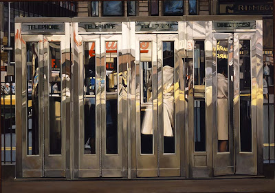 Richard Estes
 Janet Fish
 Richard Estes
 Janet Fish
Thursday, September 11, 2008
Morandi vs. Van Gogh: Color


Morandi:
Morandi's choice of color is very neutral. He has used more natural tones, like raw and burnt sienna, and raw umber. He has also used some white, making the paint less vibrant and colorful. Although Van Gogh's "Irises" painting has a plain off white bacground that is similar to Morandi, he still has warm and cool blues that make up the iris flowers. in terms of subject matter, Morandi uses man made objects. that is very opposite from Van Gogh, who uses a lot more palnts and flowers.
Morandi's choice of color is very neutral. He has used more natural tones, like raw and burnt sienna, and raw umber. He has also used some white, making the paint less vibrant and colorful. Although Van Gogh's "Irises" painting has a plain off white bacground that is similar to Morandi, he still has warm and cool blues that make up the iris flowers. in terms of subject matter, Morandi uses man made objects. that is very opposite from Van Gogh, who uses a lot more palnts and flowers.

 Van Gogh:
Van Gogh seems to like at least some bright color, that pops out with a more natural colors. for example, the blue of the irises against a white background. even if Van Gogh has a more nuetral color in any part of his paintings, he usually also has bright, rich warm and cool colors as well. In the "sunflowers" painting, Van Gogh uses oranges and yellow. He stayed in that color range, however the different ranges of the yellows (rust, cadmuim and even a yellow-green for stems) make up fot the non existing blues, reds, and violets.
Wednesday, September 10, 2008
What I Know Now
the primary colors are: Red, blue and yellow
the secondary colors are: red and blue: violet (purple), green, orange
you create the secondary colors by: red and blue: violet, blue and yellow: green, yellow and red: orange
complimentary colors are: (opposites) red-green, orange-blue, yellow-violet
two ways you could emphasize something in a painting: by using shadows and highlights you make the object pop out instead of flat looking
if I were trying to create a shadow on an object in a painting i would: first I would make a dark violet. Then I would add a tint of the objects color. Finally I would put the shadow in the places that had shadows.
if I were painting and object and i wanted to create the illusion of a highlight I would: first I would mix the color white with a tint of the object's color. then I would place it in the necessary spots. Finally I would blend the highlights a little around the edges.
if I were trying to make an object look like it's far away I would: first I would find the vanishing point of the painting. Once i have painted the horison (or border), the objects in the painting will be gradually smaller as they are closer to the vanishing point.
these are the steps I would take to build a painting: first I would make the canvas. then I would put two coats of jesso on (giving time inbetween for each coat to dry). Remember: GENERAL TO SPECIFIC: First i would draw in a basic outline of the painting for guidelines. Then i would put the shadows and highlights. then Iwould get inthe background colors. finally I would get more detailed, but only after the basic colors and shapes are painted into the painting.
Wednesday, September 3, 2008
A Painting I Remember
A painting I remember is the first painting I fell in love with when i was only in first grade. It was painted by Van Gough by the name of Sunflowers. I loved this painting because it was a simple painting of sunflowers, with a background that was powerful, but did not overwealm the painting by taking away from the flowers itself. Instead, the background was a light, icy blue, which complimented the mustard-yellow of the petals by making them pop out. I chose this painting because recently while traveling to a museum, I randomly came across the painting and was really happy to see it. Although Van Gogh painted multiple sun flower paintings, this one managed to stick in my mind as one of my favorite pieces. I especially love his brush strokes. When you look closer you can view every brush mark that he made, giving the painting a good texture.
My Skills As An Artist
I have loved art for a very long time, and I have seen myself grow into a better artist over the years. I have taken as many art classes as possible in order to cover as many art terms, teqniques, mediums, forms, and styles of art. Although I feel I have a long way to go as an artist, I am proud of what I have accomplished for only being eighteen. Over my Beaver career, I dont think I have missed out on a single visual arts class. Outside of school, I have gone to Mass Art and to a program called Les Tapies in France and I draw and paint on my own time. I struggle with making obects pop out, and look round but I feel like I am strong in color mixing and finding the highlightes and shades required in painting. I also feel like my drawing skills have improved enormously, partly because of taking a figure drawing class. I hope that my drawing skills will be able to help me with my painting skills as well and that over the term I am able to work on my weaknesses to create them into strengths.
Why I'm Taking Oil Painting
I have always been interesting in oil painting. I took it last year to expand my knowlege on different mediums, and this year i want to improve my painting skill from last year. My goals for this couse are to create pieces for my portfolio and to create an idea of what i am capable of in making paintings for my portfolio. Although I have already taken this course, i still plan to learn and improve by refreshing my mind of the skills i learned last year. I plan to push myself and challege myself in order to create a better understanding about where i stand in oil painting and to achieve the skills i need for college.
Subscribe to:
Posts (Atom)